Android Wheel Widget

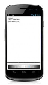
This is a simple widget I created as part of the Aviary Editor SDK for Android. It creates a wheel-like widet which can be scrolled in both directions.
The idea was to replace the default slider widget and use a more “real world” component.
Moreover if you’ll add the VIBRATE permission into your AndroidManifest.xml file you’ll have also haptics feedback while the wheel is scrolling:
[cce]<uses-permission android:name=”android.permission.VIBRATE” />[/cce]

To include the wheel widget in the current layout, you should add in the layout xml this lines:

<it.sephiroth.android.wheel.view.Wheel
android:id=”@+id/wheel”
xmlns:sephiroth=”http://schemas.android.com/apk/res/it.sephiroth.android.wheel”
android:layout_width=”match_parent”
android:layout_height=”match_parent”
sephiroth:numRotations=”6″
sephiroth:ticks=”28″ />

Where numRotations is the max number of rotations the wheel can perform and ticks is the total number of ticks the wheel will display.

Then in your activity you can add a OnScrollListener listener to the wheel widget, in this way:

mWheel = (Wheel) findViewById( R.id.wheel );
mWheel.setOnScrollListener( new OnScrollListener() {

@Override
public void onScrollStarted( Wheel view, float value, int roundValue ) {
}

@Override
public void onScrollFinished( Wheel view, float value, int roundValue ) {
}

@Override
public void onScroll( Wheel view, float value, int roundValue ) {
}
} );

You can download the source at the gihub project page.
Android Workspace Widget


I was looking for an android widget similar to the launcher workspace widget ( the one used in almost all launchers ), but a bit more customizable and with the possibility to use an Adapter as content provider. So at the end I mixed portion of code from the android launcher Workspace widget, the Gallery widget and the AbsListView widget.

Nothing particular tricky, just a combination of the 3 widgets in order to have the same sliding effect of the workspace ( using custom number of columns and rows ), but at the same time with an ArrayAdapter for creating views, and a little glow effect at start at the end of scrolling for creating the gingerbread style overscroll effect.

This is the source code: workspace

It’s just a first version, so it’s not really optimized…

The adapter used for creating this example looks like this:
[cc]
class WorkspaceAdapter extends ArrayAdapter {

int screenId;
PackageManager pm;
private LayoutInflater mInflater;
private int nCellsPerScreen = 4;

public WorkspaceAdapter( Context context, int textViewResourceId, List objects ) {
super( context, textViewResourceId, objects );
screenId = textViewResourceId;
pm = context.getPackageManager();
nCellsPerScreen = context.getResources().getInteger( R.integer.config_portraitCells ) * context.getResources().getInteger( R.integer.config_portraitRows );
mInflater = (LayoutInflater) context.getSystemService( LAYOUT_INFLATER_SERVICE );
}

@Override
public int getCount() {
return (int) Math.ceil( (double) super.getCount() / nCellsPerScreen );
}

public int getRealCount() {
return super.getCount();
}

@Override
public View getView( int position, View convertView, ViewGroup parent ) {

if ( convertView == null ) {
convertView = mInflater.inflate( screenId, mWorkspace, false );
((CellLayout)convertView).setNumCols( nCellsPerScreen );
}

CellLayout cell = (CellLayout) convertView;

int index = position * nCellsPerScreen;
int realCount = getRealCount();

for ( int i = 0; i < nCellsPerScreen; i++ ) { CellInfo cellInfo = cell.findVacantCell( 1, 1 ); TextView text; if ( cellInfo == null ) { text = (TextView) cell.getChildAt( i ); } else { text = (TextView) mInflater.inflate( R.layout.application_boxed, cell, false ); CellLayout.LayoutParams lp = new CellLayout.LayoutParams( cellInfo.cellX, cellInfo.cellY, cellInfo.spanH, cellInfo.spanV ); cell.addView( text, i, lp ); } if ( index + i < realCount ) { ApplicationInfo appInfo = getItem( index + i ); CharSequence label = appInfo.loadLabel( pm ); Drawable bm = appInfo.loadIcon( pm ); text.setCompoundDrawablesWithIntrinsicBounds( null, bm, null, null ); // new text.setText( label ); text.setClickable( true ); text.setFocusable( true ); text.setVisibility( View.VISIBLE ); } else { text.setVisibility( View.INVISIBLE ); } } return convertView; } } [/cc]  

Widget: SlidingDrawer top to bottom

My android experiments continue…
In the last project I had to implement a SlidingDrawer which comes from top and left. The problem was that the default widget does not support all the directions, but only bottom to top and right to left.

That’s why I grabbed the SlidingDrawer source code and modified it in order to allow any direction ( defined as styleable in attrs.xml ). The only problem using custom styleable xml is that if you want to use this widget as library you need to include in the main project also the attrs.xml file as well.. a bit frustrating.

Anyway this is just the sample xml how to include the widget:


Btw If you’re interest, here you can find the full source code of the widget including a running application:

SlidingDrawer Demo 

* Updated the code thanks to Maciej Ciemięga.